


RATIONALE
Over the last decade, plastic landfill waste has become a prominent issue around the world. Research showed that the average individual in south Africa produces 3kgs of waste per day in their homes, equating to 1 ton per year. Consumers are unaware of the impact they are having on the environment.
Therefore, overall objective of this project was to find a solution that reduces the creation of plastic waste that comes from the over consumption of house hold goods and to help consumers adopt the idea of reducing, reusing and recycling what we already have with ease. In order to do this the brand tensil was created in aim to solve the problem of unsustainable shopping habits by giving individuals a new alternative in order to make more sustainable choices.
The start of this project was done due to the interest in plastic packaging. According to a Greenpeace report the world produces 260 million tonnes of plastic per year, of which around 10% ends up in the ocean. The project started with understanding the issues in and around South Africa in relation to sustainable design choices.
IDEATION
During the ideation and prototyping phase, focus was on designing an ergonomic product, that was modern and simple. Experimentation was done using a wide range of forms, and shapes and sizes. The aim was to achieve a simple design, a product that stands out but is still subtle, one that feels comfortable, but at the same time, blends into the environment.


PRIMARY LOGO
The name Tensil comes from the name utensil and by removing the U it helps consumers see that we are capabale of reducing the things we have for something better and more environmentally friendly. The detachable nature of the products is showcased through the logo through the disconnection of the U from the word utensil.Everything about our name aims at echoing reusing, reducing and recycling. The style of the logo is aimed at showcasing a modern capsule living lifestyle and the physical letters "T" and "I" also indicate that sense of detachment. By showing the detachment we aim to indicate how easy it is to remove something and recycle it effectively without loosing the use or function of the product.

SECONDARY LOGO
With regards to the secondary logo, Tensil is a universal brand that can be used anywhere and everywhere. Inspiration was taken from the universal symbol of a circle which is evident throghout our brand. The circle represents the life cycle of our product range being, reducing, reusing and recycling. A circle is a never ending shape that aims to showcase how our brand is never ending, it simply rejuvenates its life cycle.

FONT CHOICE
For the primary font, Brandon Grotesque Black has been used and for Secondary font the Brandon Grotesque Regular has been used. This type face showcases a a sleek modern feel ensuring a minimalistic outlook on the brand. The various fonts come from the same family keeping the designs cohesive and simple.
or our elements inspiration was taken from the various circle figures throughout the logo. Each element has been extracted from our primary logo to help build a cohesive brand image. Every element has a curved edge and is circular in some form. The colours used in our elements also come from the logo.

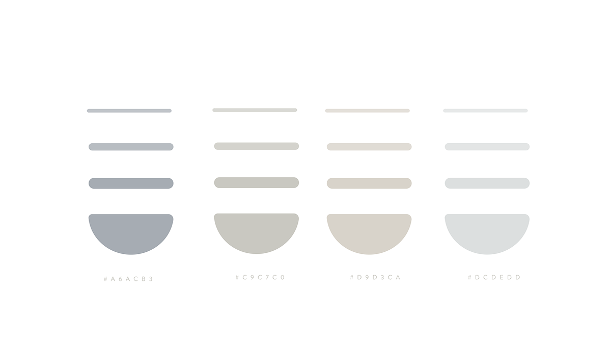
COLOUR PALETTE
Our colour combination, stems for the natural hues of the earth. We wanted Tensil to represent natural aesthetics so by using earth tones we aim to represent who we are through our colour scheme but in a modern way. Tensils lifestyle is modern, sheek and easy and we feel these colours spoke to that.
PRODUCT
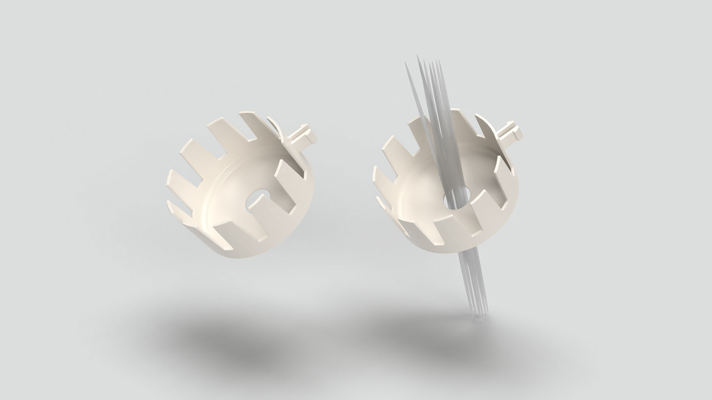
Tensils kitchenware range is a utensil range made out of 100% bamboo fibre. The utensils allow for an easy detaching and reattaching with a smart storage component. The pack comes with a serving spoon, ladel and a spaghetti spoon along with two handles and a storage compartment.
UTENSIL PIECES
Tensils kitchenware range is a utensil range made out of 100% bamboo fibre. The utensils allow for an easy detaching and reattaching with a smart storage component. The pack comes with a serving spoon, ladel and a spaghetti spoon along with two handles and a storage compartment.
The set comes with 3 head pieces being a serving spoon, a ladle and a spaghetti spoon. These 3 items serve as an integral part in everyones kitchens and are all sized to be 1 cup size which is 250ml. These pieces have a clip mechanism that allows consumers to attach and detach the pieces from the handles with ease. The set also comes with 2 handles to be used to attach to the heads.


PORTION CONTROL
As mentioned previously all the utensils are sized to be 1 cup size which is 250ml, this allows for perfect portion control aspect in the utensils. The spaghetti spoon specifically has a whole in the centre ensuring the correct portion of pasta to be cooked per person.

Storage Container
the set comes in a sleek modern container that allows for the handles to be placed in the base out of sight and the 3 utensil pieces to be stacked above with an overall casing that covers the entire pack.

SOCIAL MEDIA
The brand needed to be clean and modern and project a more minimalistic sustainable lifestyle. The brand aimed at being trendy and providing a calm emotion.The brands instagram pages needed to be modern and minimalistic however still enough information for the consumers to understand and get to know the brand. Various mediums such as images and small animation clips were used to help keep the consumer engaged in the content.
Tensil embarks on an interactive campaign via instagram that allows consumers to interact with the account and learn more about the brand. The campaign entails the brand launch, product launch and relationship building between the brand and its consumers.
WEBSITE
The instagram campaign informs individuals to visit the website, here consumers will find more info about the brand and longer videos about the products and our recycling. The website serves mainly as the platform for online shopping, Here individuals will be able to purchase the Tensil range as well as find out more information about the brand

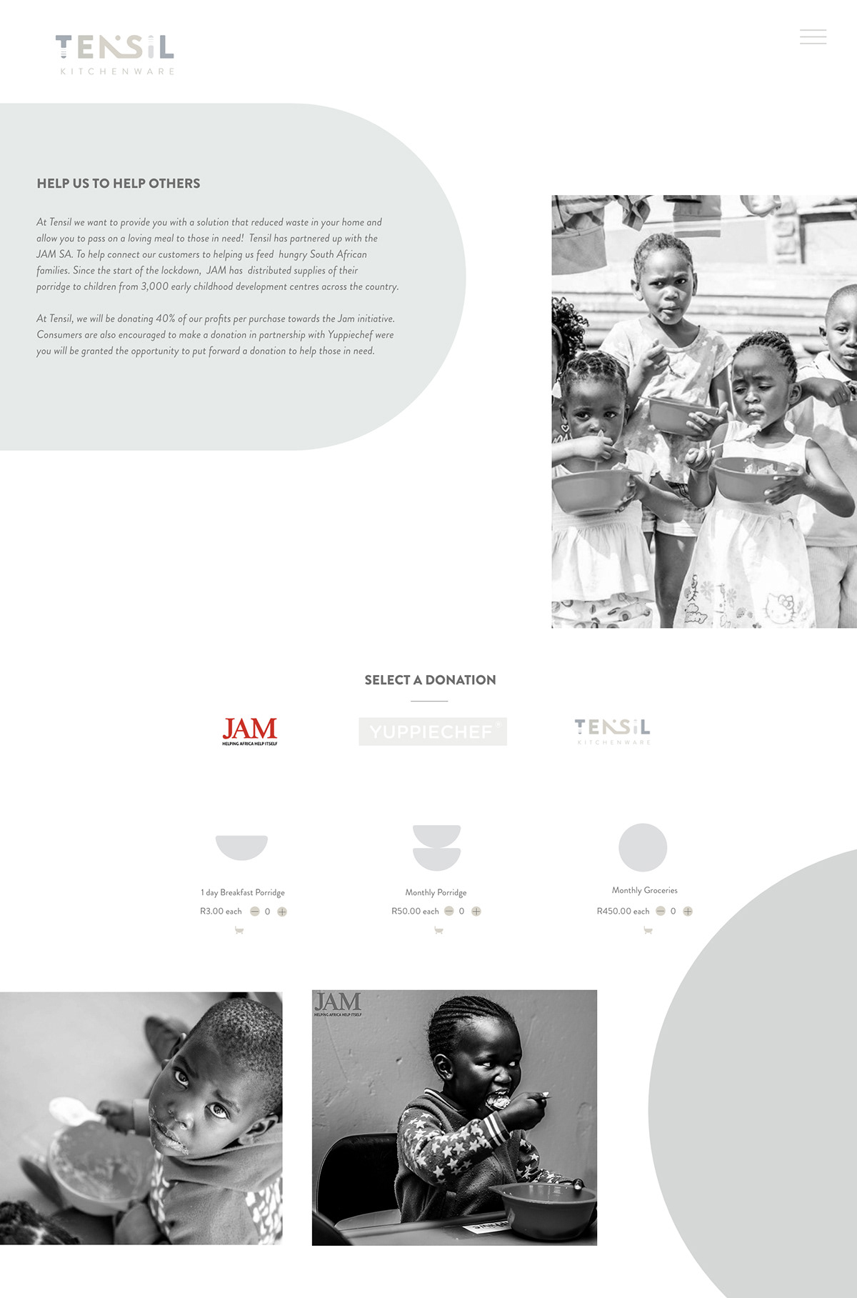
JAM SA INITIATIVE ON THE WEBSITE
Jam SA is an organisation that aims at reaching sustainable change though providing programmes to children who need support and communities that need help. For the focus of this project, close interest is drawn to Jam's feeding scheme initiative whereby the organisation provides meals to children in need providing the correct nutrition to ensure they stay in school and build a future for themselves. Currently, JAM SA feeds over 120 000 children in more than 2500 centres in 9 provinces across the country. On the website consumers have the ability to make a contribution towards the jam initiative with every purchase.
All images supplied by JAM SA
Target Audience
Kitchenware products have always been made from a form of plastic. Throughout research it was a core aspect to focus on who the target audience is to help establish the brand and its values. Many individuals use plastic in their homes without realising how much of it leeches into their food and homes on a daily basis, effecting both the environment and their own health. The question posed here is who are those individuals?
The area of focus was house hold goods but it now was a matter of finding out who was making the purchase decisions for household goods and how we could change their mindset. The target audience was narrowed down by 3 core factors:


Overall it was concluded that individuals liked items that had more functional aspects to them. They want thing that are easy to store and easy to use and people are aware of the materials they buy but due to the inconveniences caused many do not follow through with the sustainable choice.

Through the research it was established that the brand would need to have two core functions, an environmental investment and an aesthetic responsibility. The brand aims at combing these aspects into one core brand that allowed for a brand positioning of a capsule living lifestyle. The purpose of the brand is to create a sustainable kitchenware brand that positively impacts, environment, economy and society. The vision is to create utensils with a purpose and the mission is to inspire a healthier capsule lifestyle.


